Mission and objective
This project was an individual part of the exam in the course “Visual Design” at Stockholm Institute of Technology . To get the highest grade, I was required to
- Describe deeper knowledge and concepts in/about layout, typography, color theory
- Demonstrate skills in creating satisfactory specifications for handover to development
- Demonstrate competence in creating design solutions that meet WCAG AAA level in visual design
The mission was to
- Develop suggestions for logos, colors, and fonts for ReWatch, which can be used in digital communication
- Present a visual style that can be used on the service to market ReWatch to the intended target group
- Develop graphic design for a responsive desktop and mobile for the launch of ReWatch
Fictive background
With Scandinavian design and manufacturing, the watch brand ReWatch will establish itself on the market. The company has decided to only sell the watches online. The target group is the environmentally conscious and design enthusiast who would like to buy remade products. The watches are made of 75-100% recyclable material and spare parts. Each watch is unique depending on the availability of parts from which they are assembled.
ReWatch combines sustainability with an elaborate design that makes it something of a statement about sustainable development rather than just an accessory that shows the times. It is a watch that will communicate the personality of the owner in the form of environmental awareness. They have come so far that the watches have been produced on a smaller scale and will now start being marketed online and with the opportunity to also buy them.
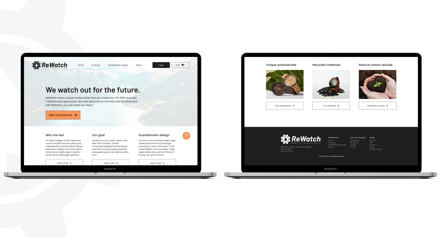
Responsive web - desktop
Rule of 12
I have chosen to develop a graphic design for a simpler landing page with quite a lot of air, where you can briefly see what the company does and stands for. The layout follows the rule of 12 to make it easier to align components and other elements. In the header you can go to the pages you want, see your statistics on the shopping cart, log in as a customer and contact customer service.
The hero conveys a strong message about recycling and a unique product where a clear CTA takes you to e-commerce. Furthermore, a short and concise introduction to the company and its message follows. To the right I have placed a "sticky" help button that follows the user through the scrolling. During the intro text, I have added the features block where the user is attracted (if you want) to see more of the products, the way ReWatch works and the core of service and the company.
Finally, there is a footer at the bottom of the page where the user can get a quick overview of the website.
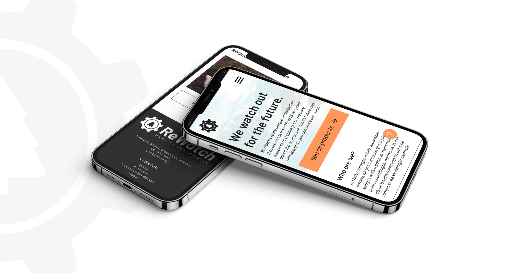
Responsive web - mobile
Rule of 4
The mobile variant follows the desktop layout and has the same clean style. This is made possible by the fact that I have adhered to the 4 column rule, which can be easily applied when the desktop lives on the rule of 12. I have chosen to place all longer text left due to increased readability, further down at features and footer the text is centered for faster scanning of the content.
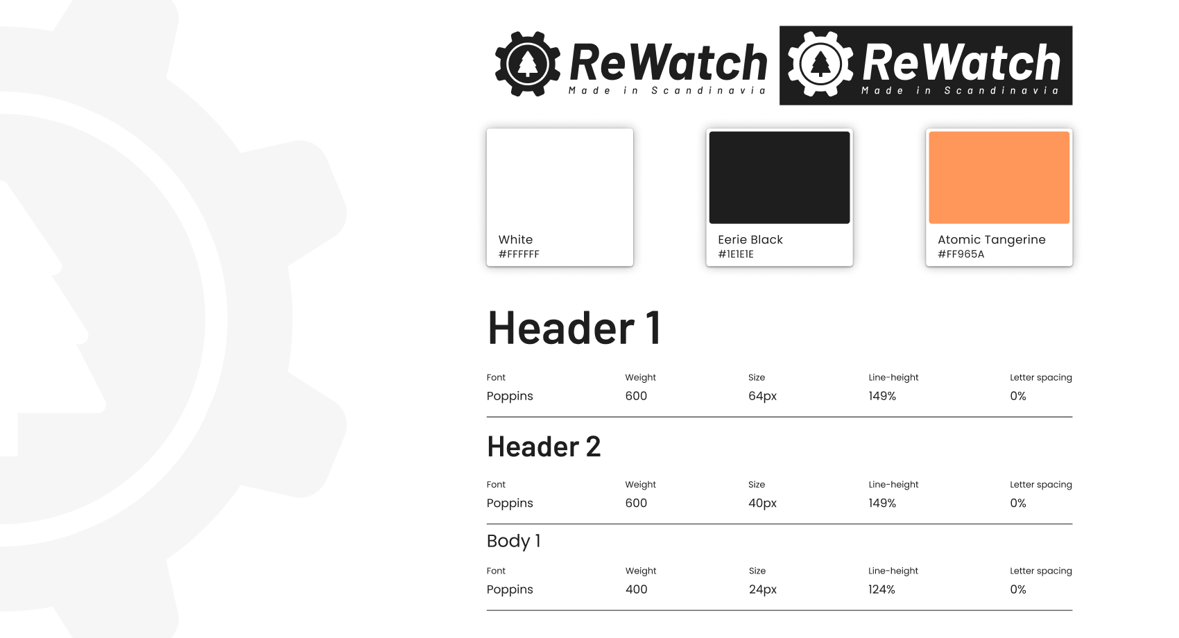
Graphic concept / guidelines
I have chosen to focus on a modern and simple style when it comes to logos, colors and fonts. The logo is a mix of a symbol and wordmark, and represents both the machinery behind the bells and the nature the company preserves. Wordmark is shaped in italics (italic) which gives the impression that things are moving and creating progress. I have also produced an inverted logo that is suitable for dark backgrounds.
The fonts are unpretentious and easy to read. Bold body text has a line height of 149% and regular body text has a line height of 24px, for increased readability.
The color palette is relatively simple. I have chosen to go for exclusively a matte 87% of black (for increased readability) and white with a earthy orange (CTA) that breaks with everything else, which also directs the eye to the product catalog and the help button. I believe that no more color is needed at the moment as I want to keep the design simple, modern and efficient, which also represents what the company stands for.